Category Archives: mobile

New Book Published: Tap Into Mobile Application Design

After a long delay due to some health issues, I have finally finished the first version of Tap Into Mobile Application Design. This book is only available in PDF and epub electronic formats which should work on most e-reader apps on most mobile devices. I used Leanpub as the publishing platform, as with Tap Into Mobile Application Testing. I like this platform because it’s faster for me to get content out there, changes and updates are instant, and customers can download updated copies for free.

Tap Into Mobile Application Design book cover

This book is long and detailed, a result of me trying to capture most of my thoughts on designing software for mobile apps. When I started the book, I had planned for something much shorter, but as I worked through the content, it felt abbreviated and overly simplified. In Tap Into Mobile Application Testing, I made a couple of mistakes trying to overly simplify complex technical issues with regards to wireless technology. I updated some of the content to be more accurate, but I didn’t want to repeat that problem with this book, so I went deeper in some technical areas.

To help illustrate the challenges we have on these projects, I decided to use an example app project in the book. This helps to ground the content, moving from initial idea, to a full user experience design process and ending with user testing. The example project helps illustrate what a real world project can look like, but with the benefit of time I was able to capture many design project issues, rather than the few you encounter on a rapidly developed app. You get it all, including the positives and the negatives of the example app.

Furthermore, the context of app design changed as I was writing, and I felt I should capture some of those changes in the book as well. The legal landscape has changed, and there is a much better awareness of ethics and the long term effect of our designs on people. With the benefit of a side project to use as the example in the book, I was able to capture these issues as they happened on that project. The project had to adjust, and that is reflected in the book. Unexpected issues are common on mobile projects, and the example app shows how we adjusted. Initial attempts often fail due to oversight, legal rulings have an impact, and the timing of what you do on a product is crucial.

The book is also longer because it doesn’t just follow a happy path. There are lots of great books out there that fit that model. Instead, this book covers false starts, changes in direction and a completely reworked interaction design. That’s right, I cover how we almost went to market with one design, hit a snag, and completely redesigned the example app from the ground up. It’s difficult to capture the non-linearity of design in a book, and that results in some awkward flow and a couple of extra long chapters. I apologize for that, but I had hoped this would be an honest and detailed account of what can happen when you are creating an app.

I have also created a book bundle, combining both my “tap into” books called Tap Into Mobile Apps, where you can buy both the books for about the same cost as the full price of either book. The books are very different, but are complementary. In Tap Into Mobile Application Testing, the reader follows Tracy, a tester who is learning about mobile testing approaches. In Tap Into Mobile Application Design, the reader follows an example mobile app project called “Reporter” throughout the book. The design book is more heavy and dense content-wise, and that is reflected in the tone. The testing book is lighter in content and tone and an easier read. Both books cover technical issues to help inform your work. The combination of designing for or testing for people in social contexts, with a deep understanding of the technical underpinnings of the technology, within real world environments is my core differentiator. When I help teams develop that three pronged approach themselves, they build better software and have happier customers.

Both of these books represent my approach to working on mobile apps, which people can utilize as they see fit. These books aren’t for everyone. They are long and detailed and don’t provide easy answers. What they do provide is context and details that are important to understand on mobile projects, especially when you are having trouble. In spite of it representing a more difficult approach to your work, Tap Into Mobile Application Testing has been used by people all over the world, and influenced many mobile projects. It was highly praised when released and even now people contact me to tell me about how much it helped them. People still use it, they still talk about it at conferences and on projects, and several years on, find it relevant and helpful. I hope as many people find the design book to be as useful as they found the testing book.

Gamification Principles for Product Management Revisited

A few of you pointed out that the link to my 2014 article for commercelab is down, so I have uploaded a PDF of it: Gamification principles you should consider in mobile product management

As I read this article, I realized there are two more important aspects that I have learned in the past couple of years that I should share. This is what I would add if I were to write the article today:

Focus on your core, and build out from there

Games have to focus on their core function or they won’t get used. For example, a lot of games focus on movement and actions (fire, gather, etc.) and then add functionality on that. If you don’t have the basics, you won’t have a very good app. If your game has a poor core function, it won’t get used, so their survival depends on it. It’s easy to get caught up in neat features, or cool ideas, but if the core isn’t solid, the experience will suffer. How do you identify the core? Take away everything, and then add back technology and features until people can get the job done with your app and no more.

Summarize and display of important information

Games are creating and operating with huge amounts of data, yet they don’t overwhelm players. They use clever views, HUDs and maps to show you what you need in context, and right now. Some games are brilliant at showing you what is important within your current location and context, yet providing cues to change focus and look elsewhere for important events or information. They are brilliant at information architecture and information display. We are often at a loss with non-game apps and easily overwhelm and confuse users. Games on the other hand have a lot of approaches for showing just the right amount of information, in a way that grabs your attention, right when you need it.

Interview with Anna Sort: Gamification in Health Care – Part 2

This is Part 2 of my interview with Anna Sort. If you haven’t already, check out Part 1 of the interview. Anna is a professional nurse who is working to bring together smartphone and video-game technology into healthcare. She is also an Associate Professor at the University of Barcelona, and works both as a gamification and as a serious games consultant.

Designing a Better Life Interview with Anna Sort – Part 2

Jonathan: What can go wrong with a system that utilizes technology and gaming mechanisms with a worldwide pool of contributors (aka “the crowd”)? For example, how do you design your game to prevent or deal with the abuse the rules or take advantage of bugs or loopholes?

Anna:
I think you cannot really prevent people from trying to cheat in a game, it is part of the challenge and the fun for some people to try to exploit games, so you just have to do your best designing to make it fun to play the regular way rather to make it “uncheatable.”

In our World of Warcraft diabetes add-on we are still deciding if we want the add-on in itself to be fun or not. However, what is clear is that if people wantsto cheat they are allowed to. The add-on is created to fit an exploring environment rather than a “win” situation, it is there for the player to decide whether to play using risky behavior and try what happens if you mix certain things/eat certain foods or to try their best to always “keep in track” with their glucose. It will definitely be exciting as well to see what people will do with the add-on in the end! We are here to learn about how people interact and react to “serious gaming” (using an already existing game for other learning purposes).

Jonathan: What are the biggest challenges you face from a design perspective to create something that people will interact with? How do they apply their virtual learning to their own real lives?

Anna:
This is a very interesting question and is something we ask ourselves. This isn’t explored that much in “serious games” in general. We hope to find out more about this with this experiment. However, we hope to help people understand how the diet and exercise affects diabetes, so in this first experiment we aren’t looking to change behavior in real life, but we will have a couple of questions regarding whether users have made any changes in their lifestyle at the end of the experiment.

Jonathan: What does success look like for your World of Warcraft Diabetes mod project?

Anna:
This is a very difficult question. In this first trial it will be complicated to have a bar to measure to say: “Yes, I’ve succeeded”. At the moment we are working on the add-on but there is a lot of work to do regarding questionnaires. How many will download it? How many will play it? What will be their reaction? There is a lot of work still to be done to determine a good answer for this question.

Jonathan: No problem. When you are truly innovating, you don’t really know until you try out an idea, discover what happens, and refine. Moving on, what new thing/trend/innovation are you keeping your eye on at the moment? Is there anything else you’d like to share with us?

Anna:
I’m very much into gamification and self-tracking apps. I’m a nurse so I’m all about prevention and I think mHealth (mobile health) offers us a great opportunity to focus on that and giving the user tools to take charge in their well being, lifestyle and health.

For more on these ideas and more, check out Anna’s latest presentation: Video Games and Gamification for Health Care .

Jonathan:
Thank you again Anna. I hope for the best in your work, and thanks for contributing to something that is important to all of us!

If you’d like to help out Anna with her WoW diabetes mod project, contact me and I’ll put you in touch with her and her project team.

Interview with Anna Sort: Gamification in Health Care – Part 1

For my first blog interview in my Designing a Better Life series, we will be chatting with Anna Sort. Anna is a professional nurse who is working to bring together smartphone and video-game technology into healthcare. She is also an Associate Professor at the University of Barcelona, and works both as a gamification and as a serious games consultant. I find Anna inspiring because she is working hard in the area of mHealth (mobile health) and games for health.

anna_sort
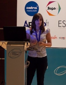
Anna Sort speaking at the Gamification World Congress

Anna is based in Spain, and graciously agreed to this interview in English for me, and for you, our readers. For more about Anna, check out her blog: Lost Nurse in the Digital Era and these two videos on youtube of her presenting: Designing Games as a Nurse, Gamification of Health Products.You can find her on Twitter here: @LostNurse.

Designing a Better Life Interview with Anna Sort – Part 1

Jonathan: Please tell us a bit about yourself. How did you get involved in the games for health field?

Anna:
I have always been a gamer but programming never attracted me. I was looking for a job as a nurse abroad when Blizzard Entertainment called me to be a customer support representative in France. They offered to take care of housing and banking, making it easy to move and start work in a new country. Also the multinational office work was something I had always wanted to try (and being a CS for the game World of Warcraft also seemed very cool). After 6 months I took the nurse spot in the company, and being a gamer working with gamers made me realize how much easier it would be to communicate and experiment some health information through games rather than 30 minute talks plus a flyer to never read at home.

After a while I started to look for Masters degrees that would allow me to go into a “techie-nurse” path. I found an interesting Master’s degree called CSIM, which was focused on a multidisciplinary approach to problem solving. I was the only healthcare student in the class, most of my classmates were designers, artists and programmers, but surprisingly 2 of the 8 Masters Thesis projects would have benefited from a healthcare professional, a rehabilitation system and an exergaming platform. In a way that reassured my idea that this “new profession” I wanted to pursue would eventually exist.

My thesis was about the quantity of exercise the children did while playing on an inflatable slide that had a game projected on and kids interacted with through an infrared system (it’s called an “exergaming platform”). I took part in the game design as well as the exercise experiment for my thesis so it was really interesting. I worked on a multidisciplinary team and I loved it. After my master’s I started my career alone, and soon enough I was contacted by Homero Rivas in Stanford, whom I talked about my vision in games and we are currently developing with MIT the first World of Warcraft health add-on to raise awareness on Diabetes.

Jonathan: The research and work that you do sounds fascinating. Can you explain how your work can help make our lives better?

Anna:
Behavior-wise humans are prone to play, and games offer a wide variety of play, such as exploring, competing, collaborating and self expression. Taking gaming into healthcare is a way to make taking charge of one’s health more interesting, intriguing and motivating. It is not about making fun of having diseases or trivializing them, making it less important because it’s a game. It’s about providing the tools and inspiring the motivation and behavior change to be healthy and improve your lifestyle.

Jonathan: I love your World of Warcraft Diabetes mod project. Can you tell us about this project and your goals? Is there anything we can do to help you?

Anna:
Thank you. It is a very exciting project indeed, and challenging! Especially because the game World of Warcraft has a pool of 9 million users, which means if 5% of these users download and play the add-on, we will have the biggest Health Game research experiment ever made!

The add-on is an “add” on the game which you download that changes the user interface. What we have done is add a glucometer on the side that is impacted by the player’s actions, such as running, fighting and eating foods. World of Warcraft has a lot of foods, drinks and alcoholic beverages so it makes the experimentation part very interesting. It isn’t focused on the disease itself, as we are aware not everyone reacts the same way to foods and drinks, and compositions aren’t equal worldwide. We want to raise awareness, and maybe even make new users having youngsters encourage family to play to see what is it like to live with diabetes.

We are not sure what people we will attract and we also are still debating whether we should gamify the add-on or if the game is good enough as-is people will still enjoy the game with the add-on. All the steps should be taken care of very wisely as the amount of research information might overwhelm us otherwise and turn out to be unusable.

How can people help? We still need a good experiment designer to take part of the team, so anything on that regard is helpful. And programmers. Hands are always needed!

Jonathan: What design concepts do you find the most useful for this project?

Anna:
Possibly the most important part of our design process will be focused on the tutorial. World of Warcraft has an excellent tutorial to help new players get on board, and since the new players we might attract will already have a whole game to learn, we want to make sure the on-boarding of the add-on doesn’t collide with the game tutorial and so it doesn’t overwhelm the player.

Stay tuned for Part 2.

Designing a Better Life

Often, my public work lags behind my current interests or passions. That’s ok, it usually catches up in time. However I wanted to talk about my current focus and passion right now: designing systems for a better life. If you read my blog regularly, you will notice a shift towards design, user engagement and other topics. I wanted to explain why.

This has been a tough year. I’ve been on the road a lot, and I have met a lot of fantastic people and worked with some amazing organizations. However, I have been away from my family and friends here at home, and I have missed out locally. The Alberta flood disaster forced me to look at my local, real life. This spring we found ourselves evacuated from our home, staying with friends wondering if the flood would wipe out our house and property. Unlike many others, we were very fortunate and came home to no damage, but it changed our perspective. A few days earlier, we took for granted that we had a safe, dry, secure home to always use as a refuge no matter what happened in our work or public lives. We came home and celebrated with our neighbors that we were all ok, and then we did what we could to help each other. I realized I need to do more to contribute to my local community as well as virtual communities.

The Alberta floods, like so many natural disasters, brought the best out in people. Organizers were turning away volunteers because they had too many, and entrepreneurial types turned their energies towards creating systems to harness that energy and that willingness to help others. I was amazed at how people used social media to mobilize people to work for a common goal and to help out others. Mobile technology wasn’t just about screen sizes and sensors and wireless conditions or merely staying informed about the emergency going on around them, (which was incredibly useful and important.) What was more interesting was the technology was helping people help others, and to mobilize together to collaborate. This is incredibly powerful. The technology enabled people to do something in real life. It wasn’t just about sharing pictures of food and videos of cats on social media, or wiling away hours playing Candy Crush or Angry Birds. This technology was exploited to make all of our lives a bit better as we lived through a natural disaster together. Those who were unaffected and wanted to help just had to grab their mobile device and utilize social media to find out what they could do to help. Those who were affected could get informed, ask for help or just read messages of encouragement.

Mobilization and collaboration to help work together to help others or to solve problems is an important area that I am exploring through human and technology systems.

Mobilization can be harnessed for helping organizations and groups of people solve really hard problems. Distributed computing can be combined with crowdsourcing to distribute problem solving amongst our most powerful tool at our disposal: the human brain. Projects like fold.it provide problems in a gaming context to help provide vital information for researchers who are looking at combating disease, or providing health care technology to improve our lives. These are enormous problems that have an impact on all of us. On a smaller scale, we can focus our energy and mobilize the people in our social circles to help us achieve health goals or recover from injury with the SuperBetter game created by Jane McGonigal. These are two powerful examples of how we can use technology and humanity together to solve problems.

Those of you who follow my writing know that this is an area that is important to me, even on simple tasks like test automation where I prefer human involvement in the computing work (see Man and Machine: Combining the Power of the Human Mind with Automation for more.) In the past, we have tried to outsource difficult problems to machines, and now we are learning better ways of getting the best of both worlds – the computing systems support us and do what they do well and enable us to really take advantage of collective wisdom and interests. I think we are just scratching the surface on this space.

Distributed collaboration to solve really hard problems is an area I am looking into more.

I’ve done a lot of work with mobile applications, and many of you are familiar with my book and course on testing mobile applications. I have trained hundreds of people, and many more have read my ideas about testing mobile apps or web experiences, but that is only part of the picture, and I do a lot more in this space than my public work suggests. To create a great mobile experience, we need vision from business leaders on how they want to use the tech – are they merely supporting it, or are they embracing mobile technology to transform their interactions with the people they are trying to help? Are they looking at mobile as something they are forced into, or are they looking to it as a new area to help increase revenue and loyalty? If business leaders are reluctant, that vision (or lack of vision) will make its way all the way down through the project, and ultimately in a poor customer experience. On the other hand, a great mobile vision is only as good as the technology that was chosen, the design of the application, and the quality of the customer experience. I have been helping organizations to create great mobile experiences in each of these areas.

A quality mobile experience requires great vision, careful choice of technology, a design that engages customers, and is reliable for people who are on the move in the real world. That reliability also depends on great design, programming and testing. That quality experience can’t be tested in at the end, so many organizations are asking for my help in other areas, such as a mobile strategy from an executive level, how to choose the best mobile technology to fit that vision, what areas need to be addressed in mobile design, and then quality practices in programming and testing. This is a fascinating area to work in, because there are many more areas to be aware of than we are used to in software development.

A fantastic mobile experience from project vision, design and execution on down to you, the person holding the device, can make your life easier, but a poor quality experience can ruin your day. I am learning how to improve this experience and I want to show you how you can too.

Some of you have wondered why I am talking about things like gamification. I am less concerned about the gaming aspect, I am more concerned with what lessons we can learn from this field with regards to collaboration and finding meaning in what we do. Modern knowledge work can be difficult to deal with over time. If the power goes out, all our work disappears, so many struggle to find motivation and meaning in their work and careers.

To me, gamification is just one of several potential models of engagement, and we can use it in different ways. If you are in a job that is difficult and you are losing hope, don’t be threatened if I talk about gamification. If making your work more like a game fits your context and your personality, as well as the people working with you, then yes, we might look at creating some sort of Alternate Reality Game (ARG). Always know I would never force that if you weren’t interested, or if it wasn’t appropriate. However, I may use mechanisms that I have learned from game designers to help with areas of work that are difficult, feel hopeless and don’t have meaning. If I do it correctly, you won’t recognize it as a game – I won’t just put up superficial gold stars and leaderboards, or worse, trivialize the important work that you do. I may however, collaborate with you to create something to help you get more meaning in what you do using engagement or other concepts I have learned from games.

That is vital in human and software systems that people work with. Can we make this activity or program engaging so they want to use it more? Can we design the system to not only solve the problems of an organization, but also to help reinforce meaning in what people do? Gamification is an interesting and powerful area of research, with a lot of potential for good, but it can also create harm. I am carefully researching how I can use this in my own work, because it is one mechanism that I see to help do something more for us.

Studying engagement models and finding and experiencing meaning in the things we spend our days working at is important and I am spending more time looking at how the intersection of software and people systems can help.

Design principles are another area of research and problem-solving for me, which are often under the umbrella of UX (User Experience). Creating great software experiences can really help us since we interact with it, or it affects us indirectly in everything that we do. A better software or computer system experience has an enormous impact on our lives. When they go wrong, they can really cause problems, but a simple, elegant solution can bring joy. User experience and design in an era where wireless and sensor technology is common, touch and gesture interaction on different technology with different screens is hard enough. What do we do when nanotechnology and other distributed or pervasive systems become much more common? I love the research and work in this space, and it is a part of what I do on projects.

The challenges we have are fascinating, so product management and product design are areas of project work for me, and what I am increasingly spending time on in my spare time.

Some of you have heard me talk about health projects. One of the most rewarding projects of my career was working on a medical program for mobile devices. It was great to try to break new ground with new technology, and determine how we could make health-care professionals lives easier, and to enable them to provide better patient care. My Mother still works as a medical professional, it is a calling, and we tease her that if she refuses to retire, she’ll pass on “in harness”. She is absolutely fine with that, she is committed to her work and patients, and takes courses every year on areas that interest her, and how to better use technology in her own work. She has passed that down to me, and finally as a professional, I have had some chances to help create better software for medical professionals. I enjoy working on medical software because I can see how we are contributing to actually make people’s lives better. When we do it right, we enable others to do great work, solve difficult problems and help real people. It’s easy to find meaning when your work has an impact on others, and we can do so much better with technology and health than we have been.

Systems that help us live more healthy lives are an area of keen interest for me, and I am interested in mobile, games for health, distributed computing, crowdsourcing and all sorts of things in that space. Healthcare professionals like Anna Sort inspire me with their creative and innovative ideas that they turn into action, and programs like Strokelink to help stroke patients using mobile technology are great.

I’m also interested in how we can create software for health professionals that is easier to use, more reliable, and enables them to focus on patients and not fight with systems that don’t take them and their unique context and work as well as the environment they are working in into account.

Finding ways to use software and related technology in health care and health research is another area of huge interest for me.

So there you have it. Watch this space for more of the above topics on how we can explore the intersection of people and technology to help design better lives for ourselves.
A Bad Mobile Experience is Bad Customer Service

As a travelling consultant, I get insight into a lot of organizations. One theme that I see over and over is a lack of understanding about mobile experiences among decision makers and technical teams. When it comes to interpersonal or written communication, companies have sensible rules and practices about making that exchange great. You’ll hear or read slogans about treating the customer right, or to go beyond and satisfy and impress them. Most organizations have great alignment on that message, and when I walk into an office, I am greeted by friendly security and front office staff who smile, are pleasant and help me get to where I need to go. They want all of us to have a great first impression, so they invest in human-friendly lobbies with art, comfortable furniture, and great lighting. This extends to email and voice communications as well. People try to be professional, pleasant, and make me feel welcome as a customer or consultant. However, that is rarely my first impression of that organization. For me, and millions like me, I get my first impression of that organization through their mobile experience.

In many cases, that mobile experience is the opposite of their interpersonal customer service. They fail to realize that a bad digital experience is just plain old bad customer service. It is the virtual equivalent of a rude call center employee, or an office administrator who tells me to go f— myself when I walk through the door. Instead of feeling valued by the organization, my mobile experience feels like they don’t care. They make me feel confused (what does this company do?), they make me feel frustrated (I can’t solve the problem I need to sort out!) and that they don’t value my time (why do I have to gesture so many times and spend so much time to do a simple task?)

These organizations would be horrified if I was flipped off when I walked in the door, but they have no problem making me feel just like that when I try to interact with them virtually on my mobile device. And they don’t seem to have a problem with it. On the other hand, organizations that realize great customer service extends to digital experiences have alignment on their customer-first values. Instead of worrying about mobile frameworks and handsets and technology development, they seek the solutions that provide a great customer service on virtual mediums. Thankfully, that means we have a lot of examples on how to do it well.

Here is an example of contrasts: airline mobile experiences. I won’t name names, but I will describe 3 different mobile experiences and the technology they are using to either create great customer service, or do the digital equivalent of flipping us off.

I travel a lot, and when I am travelling, I need the following at a minimum:

  1. Ease of use (so I can get my information quickly when under pressure on a trip)
  2. My booking details stored: confirmation number, flight numbers, seating details (this eliminates printing out paper that often gets out of date)
  3. Access to my booking details when I don’t have network connectivity (when you travel, you are frequently without wifi or cellular data, particularly if you don’t want to purchase an expensive data plan during a short trip)
  4. Up to date flight information when I am connected to a network (so I can get out of jams when there are delays or cancellations)
  5. Ability to book or modify or cancel flights
  6. Simple contact to customer service if all else fails on my own

Let’s look at three different mobile experiences from three different airlines:

  • App 1: a native mobile application
  • App 2: a hybrid mobile application
  • Web 1: mobile optimized web-only access

How do they stack up?

App 1 (native):

  1. Ease of use: incredibly easy to use, and it takes 2 gestures to get my current flight information. It takes about 15 seconds to tap the app and get all the info I need to fly
  2. Flight details stored: all my flight information is stored so I don’t need to search elsewhere
  3. Offline access: this app not only displays all my information when I don’t have networking or wireless access, but if I am not connected, it provides a warning message and tells me the data may be out of date. This is useful in cabs, in areas of an airport without connectivity (such as in security) or in an aircraft while in airplane mode so I can check my next flight if I have a connection
  4. Information updates: this app lets me know of gate changes, delays, and even lets me check on in-bound aircraft status and other dependencies. When there are problems, I and others with the app know before official announcements are made, which gives us a jump on the competition for rebooking or making alternative arrangements. This app has helped me get to a client site or get home on time on a number of occasions.
  5. Flight bookings: this isn’t easy to do on mobile devices, but with a few taps and gestures, you can get the job done without feeling frustrated
  6. Easy contact to a real person for help: one or two taps and I am speaking to a customer service rep who can help with a problem I can’t sort out with the app

App 1 overall customer experience: great!

This app has really improved my flying experience and I am growing to like this airline more over time.

App 2 (hybrid – combo of web and native technologies):

  1. Ease of use: not bad, but it is a bit clunky and doesn’t respond as smoothly to input gestures as the native app. I can’t zoom in on some screens, and on others, it takes me out of the app to the website, which is irritating. It feels quite slow, but I don’t have to do a lot of inputs, I just feel like I am waiting
  2. Flight details stored: This is a thin-client app (not taking advantage of local storage that hybrid apps provide), so I have to store my booking reference in a note, leave the app, copy it from a note, paste it in, and then wait for it to load my details. This is frustrating and takes a lot of time. There is no excuse for overlooking this with a hybrid app.
  3. Offline access: The app will not function without a good wireless connection. That means it is useless in many areas of an airport. If I want to check my flight number for a connection while the app is in airplane mode, it crashes. I have to take screenshots of details when they are available as a workaround.
  4. Information updates: The app does not provide updates. I have to navigate to the airline website or airport website and search for details on the flight. This is too time consuming and is frustrating. I get no information advantages and have to get in line with everyone else if there is a delay or cancellation
  5. Flight bookings: Not bad. Nice interface, and few gestures to get the job done. It just feels slow compared to a native app.
  6. Easy contact to a real person for help: I have to do a lot of navigating, and then I get redirected to their corp web site which is slow, cumbersome and frustrating

App 2 overall customer experience: poor.

Every time I use the app I get frustrated and I project that frustration on the airline. In one case, I was having trouble checking in at a kiosk, so I opened up the app. It gave me a cryptic error message that made me feel like my flight had been cancelled. I had to stand in a line up for a half hour to find out from a human to look into the problem and sort things out. This app requires workarounds (save my booking reference in a note or search for an email confirmation and screen shots of up to date data) to be even useful when I fly. They chose hybrid to get cross platform support, yet they don’t even take advantage of the affordances of a hybrid app.

Web 1 (mobile web site):

  1. Ease of use: horrible. I have to open a web browser, and to just enter in their URL is over 20 taps! I probably don’t have 20 taps in a month of using the other apps in total. Once I enter in their URL in my device and fix typos, 30 seconds has passed. I am then redirected to a mobile optimized web site. I can’t get both my flight status and my booking information in the same place, so to get the same information I get with 2 taps from a native app takes me over 50 taps and gestures and can take 2-3 minutes, under ideal conditions. Their image carousel on each page takes forever to load, and gets in the way of my interaction.
  2. Flight details stored: As a web app, there is no local storage, so again I have to store my booking reference in a note, leave the web browser, copy it from a note, paste it in, and then wait for it to load my details. This is frustrating and takes a lot of time.
  3. Offline access: None. I can’t do anything without a good wireless connection.
  4. Information updates: No updates. I have to go to a different website for that, and tap away on the URL, and experience the same pain.
  5. Flight bookings: Not bad. Nice interface, and few gestures to get the job done. Again, it feels slow compared to a native app and there are some inconsistencies from screen to screen.
  6. Easy contact to a real person for help: I have to go to their corp web site, which means I usually have to find the option to go to their full web site (a tiny URL at the bottom of some of the mobile screens.

App 2 overall customer experience: Rage inducing.

When this app lets me down in an airport because it takes too long to get anything done, I look longingly at the competition counters across the hall. This experience is beyond useless and it causes me to lose faith in the organization as a whole. If this is so painful, how is the flight? Also, I found that staff members have very little faith in the mobile experience. Even though I had a PassBook ticket that was valid, they reprint a hard copy when I try to board the aircraft because they “don’t trust the mobile app”. PassBook integration is one thing they do well, but people get so frustrated with an experience that doesn’t fit the needs of customers and staff on the front lines hear about it and try to adjust.

So whose app do I use the most? App 1 of course, and I also fly with them the most. I get a great customer experience with their mobile app, and they also do a decent to please us in their interpersonal interactions. The airlines that supply App 2 and Web 1 actually have better interpersonal interactions – they are friendlier and more helpful, but the mobile digital experiences are not convenient, so I don’t fly with them as often. This has less to do with the technology they have each chosen, but in how they have chosen to implement it and whether they are making technical decisions or customer-serving decisions in how they create mobile experiences.

A great customer experience that enhances convenience goes a long way. In fact, I will put up with less than ideal interpersonal interactions with a company if their mobile experience is convenient and makes my life easier. Next time you are looking at your mobile experience, no matter what the technology, ask the question: are we creating a great customer experience with our technology as well as with our people? The extent to which you use mobile technology to address that means much more to your customers than just “going mobile” and putting something out there. In some cases, no mobile access is better than one that makes people hate your company.

In an upcoming post, I’ll talk about ways our hybrid and web-only airline friends can improve their mobile customer service.

It’s Not About Mobile App Download Numbers, It’s About User Engagement

Peggy Anne Salz has blogged about using SMS to help encourage user engagement with mobile apps, based on research by her firm and Tyntec. The white paper she links to is an interesting read, but the message that sticks out for me is when Peggy says:

“The bottom line: app developers need to work out a strategy to increase engagement, not just downloads.”

How many apps do you have on your smartphone or tablet currenty? I want you to check right now, and get a rough number in your mind. (Humour me, it’s worth it to see.)

Now, how many of those apps do you use regularly? Conversely, how many are just sitting there on your device, but you rarely if ever use them?

I have close to 100 apps, and some of my colleagues think I am conservative – they have far more on their devices.  I probably use about a dozen of them regularly. As mobile consumers, we have a lot of choice for content, entertainment and productivity applications, all competing for our attention on mobile devices. We can’t use them all regularly, so we optimize our time and focus on the ones that we like, the ones we find engaging and return to again and again.

While getting people to download and install an app that you have worked so hard to build  is important, Peggy points out that an app’s success is part of a long-term relationship:

“Smart developers understand that selling apps is a serious business. But a raft of research suggests a singular focus on driving downloads is patently flawed. It’s really how well app developers can persuade us to make their app part of our regular routine that will make or break their app business. Winning is all about making the right choices to delight us again and again.”


If people merely download and install our apps and then forget about them, we lose out in the long term. Sure, we might get some initial sales, but customers will forget about our brand. They won’t come back to us when they need to have a product or service solve a problem for them, and we as suppliers are lost in the great sea of available apps and service providers. We might lose many of our initial customers for good, and that hurts. When I worked in sales, I worked very hard to have repeat customers – that’s what got me through the slow times – people coming back and asking specifically for me, Jonathan, and spending their time and hard earned cash in my direction.

In her blog post, Peggy points out that using SMS (Short Message Service) is one way app developers can use mobile technology to enhance engagement and app use. With SMS integration, customers are reminded of the app, get notices on new features, and are encouraged to use it in different ways. As consumers, we may have forgotten about a great app, and a reminder once in a while might be what we need to go back. She  provides some examples of how app developers can use SMS: “…to deliver valuable content, drive traffic to the community website, and reactivate users who haven’t interacted with the app in while.”

The lesson for app developers is that app downloads are well and good, but we need to strive for user engagement even more. Peggy makes a good case for using SMS, but what other ways can you use technology and app design to drive continued use? Another area to look at is in your app design. Is it usable and user friendly? Does it solve problems that your customers have in mobile contexts? Is it reliable under different conditions in weather, temperature, lighting, and with different network connections, latency and speed?

I have some ideas on design: Three Keys to Mobile Application Design (and soon there will be much more in my upcoming book: Tap Into Mobile Application Design), and a lot of ideas on app reliability in my e-book: Tap Into Mobile Application Testing. There are others.

In fact, the sky is the limit in mobile app development to explore engagement models. We just need to set our sights on user engagement and be creative with our use of the technology. It is not enough to just build a mobile app or mobile web presence. Long term engagement trumps downloads and installs because that means people will actually use your app more than once, and hopefully engage with your brand, and buy more products and services from you later on. Take the long view, even though we are in a pressure cooker of short term wins on many of our mobile projects.

Book Excerpt: The Seven Deadly Sins of Mobile Apps

This is an excerpt from my book: “Tap Into Mobile Application Testing“, from Chapter 10, pp. 431-432:

Here is a simple summary I created to help you think of different areas an app can fail. This is another mind hack you can use to quickly organize your thoughts, and analyze an application quickly.

  1. Lust: the app advertises that it can do a lot more than it actually can. It leaves you feeling unfulfilled and wanting more.
  2. Gluttony: it uses far too many resources. It uses up your device memory, downloads large image and other files, and slows down your device, eats up your data plan and kills your battery.
  3. Greed: the assumes you have a strong network connection, and would love to use as much of your network resources as possible. The app can’t handle poor or weak connections, or transitions between network types when you’re on the move.
  4. Sloth: the app performs very poorly. It is far too slow to respond to your interactions, and takes too long to do anything useful.
  5. Wrath: it doesn’t play well with other apps. It has special settings that override your defaults, and doesn’t allow other services to work well with it. It may even cause other apps to malfunction because of its behavior.
  6. Envy: The app is too close to other available apps out there that you would prefer to use instead. It’s a copycat. You just wasted precious time and resources to get an app that wishes it was something else, but it just can’t deliver on its features, and usefulness.
  7. Pride: The app is difficult to use, expecting users to adapt to its way instead of helping you be more effective.You are subordinate to it, and you have trouble using it, and end up feeling stupid. This is most likely due to designers and developers assuming they know better than the users, and ignoring valuable usability feedback and usability bugs.

Thanks to Shannon Hale and Jared Quinert for their help with this list.

This is now a talk!

Note: I have created a one hour talk on this topic if your company, user group or conference are interested. I provide tips for designers, developers and testers on how to create apps that are engaging and reliable for mobile users.


Tap Into Mobile Application Testing Book Now Available in Beta

Update: The book is no longer in beta. The final version was published in September 2013 and is available here: Tap Into Mobile Application Testing.

How did you spend your summer? I spent mine writing a book: Tap Into Mobile Application Testing. Now that smartphones and tablets are taking over the mobile space, there has been tremendous demand for ideas and training on how to test on these devices. I started out with my Testing Mobile Apps course, but that only scales so far. Many of you have asked me about writing a book on the topic, so I did. It’s not completely finished yet, but I managed to create most of the content I had hoped to share.

I have two audiences with this book:

  1. Mobilists without much testing experience
  2. Professional testers without much mobile experience

I wrote the book with both of these audiences in mind, and I was also pleased to learn that even deeply experienced mobile testers told me they learned a lot of new ideas and approaches for their own testing projects after reviewing the book.

It is only available in electronic formats right now: PDF, epub and mobi, which should work on most e-reader apps on most mobile devices. I chose mobile first because that’s the medium many of my readers will choose first. It’s also faster for me to get content out there, and many traditional publishers print dead tree copies first, then look at electronic versions. I am using Leanpub, which allows me to publish free updates to every reader who has purchased a copy, even the finalized version that I am targeting for a release later in the year. Once I have a finalized version, I will provide print copies using a print-on-demand service.

The Beta version is a bit rough around the edges. I still have the following on my to-do list:

  • Copy editing and attribution clean up
  • Creating figures and images
  • Section rewrites and new material where needed

If you notice something wrong, misattributed, or missing feel free to contact me and I can fix it before the final version is complete in December.

If you are curious about mobile apps testing on modern devices, I hope you find it useful.

Three Keys to Mobile Application Design – Part 4 Conclusion

In Part 1 of this series, we looked at mobility and app design. In Part 2, we looked at social aspects. In Part 3, we looked at gaming and entertainment features to consider with mobile app design. In Part 4, I conclude with some final thoughts, a simple example, and three people who inspire me.

Conclusion

What is it about some mobile applications that we use over and over, to the point of addiction? What is it about others that we seldom use? I’ve found that a mix of mobility features (and usability!), social features, and gaming/entertainment are some of the reasons why we keep coming back. We enjoy the experience of the application. It is easy to use and helps us solve problems or reach goals while we’re on the move. It helps us feel connected to our friends, family and coworkers, so we never feel alone. The app helps us quickly access information we need. It is entertaining, so we enjoy spending time in the application, and feel drawn to it when we’re away from it.

Our mobile devices have a lot of applications on them, so we have a huge amount of choice on where to spend out time. To keep people coming back to use your application, consider using the mix I’ve recommended above. To figure out that mix, make sure you observe people (but don’t creep them out!), ask questions, and spend time away from your desk in different contexts. As I mentioned in an earlier post, when I ride public transit, I feel like I’m surrounded by people using tablets with e-readers, people texting on mobile phones, or using social networking services and commenting about their trip. Others are watching TV shows or movies, or simply listening to music. When I’m in an airport, I jostle with others flocking to power stations prior to boarding the aircraft. In a restaurant or coffee shop, the people around me are staring into their screens. I observe what they are doing, but I take it a step further. If the moment is right, I strike up a conversation. Many people are happy to demonstrate their device and the programs they use, and tell you what they enjoy about them, and where they use them. As a designer (and tester), this kind of information is gold.

I also look for apps that demonstrate good mobile design, and look at what they have done well. One that has caught my eye in the enterprise space is Rypple, now owned by Salesforce. It’s a talent management app that has a mix of the three keys: mobility, social interactions and gaming/entertainment. It is easy to use anywhere, and has features to keep drawing you in. In the mass market, I look at popular games like Angry Birds, and social networking apps. What motivations to people have to use these apps? What do they do well? Conversely, what are people complaining about? Do they crash too much, or are they too slow?

Putting it All Together

Let’s try applying this thinking to a simple app. Imagine you are designing an app that provides a listing and related information for local coffee shops. Here is a brief listing of features that can help tie together a good user experience that will keep people coming back for more:

1. Mobility:

  • map integration
  • information: ratings, etc

2. Social:

  • camera and photo integration
  • social media support
  • people need to take pictures of their food and drinks so they can post them and chat about the experience with their friends!

3. Gamification:

  • unlock premium content after usage – ie. after visiting all the shops listed in the app, or for multiple visits
  • look at coupon or other deals to integrate with after app usage, or other ways to co-ordinate with local businesses for cross-promotion

A word of caution: be sure to implement these features in a way that will resonate with your user community. Make sure your mobility features work well, don’t mislead your user, and don’t have irritating defaults, such as always defaulting to their home address, even when they are traveling. With social, don’t just copy what is out there and popular and think people will like it. Take time to model the existing social connections your app users will have, and make sure your app plugs into and enhances that. With gamification and entertainment, don’t put in childish rewards for an enterprise app, or app aimed for adults, or people will just think it is lame. Again, model the space and find out intrinsic motivations, and take the context and users into account.

Good Design References

These are some abstract ideas to help you model and create your app. For implementation ideas, I look to people who specialize in mobility and are pushing the technology. Here are some people I look to for help, innovation and inspiration:

Luke Wroblewski
Brad Frost
Josh Clark

The always excellent Smashing Magazine has a fabulous piece on gamification: Gamification and UX: Where Users Win or Lose with tips on where to use gamification, and where not to use it. Smashing Mag also has a lot of great mobile design information here: The Elements Of The Mobile User Experience .

I hope you find these ideas useful as you design your own mobile apps, or work to help others. Happy app designing!